Pepsi has released new packaging designs for their cans, bottles, etc. What can I say, they are less than exciting. The Mountain Dew bottle looks amazing, but the Pepsi bottles are quite uneventful. They are clean, yet that font just looks like Geo Sans Light or Lane Narrow... 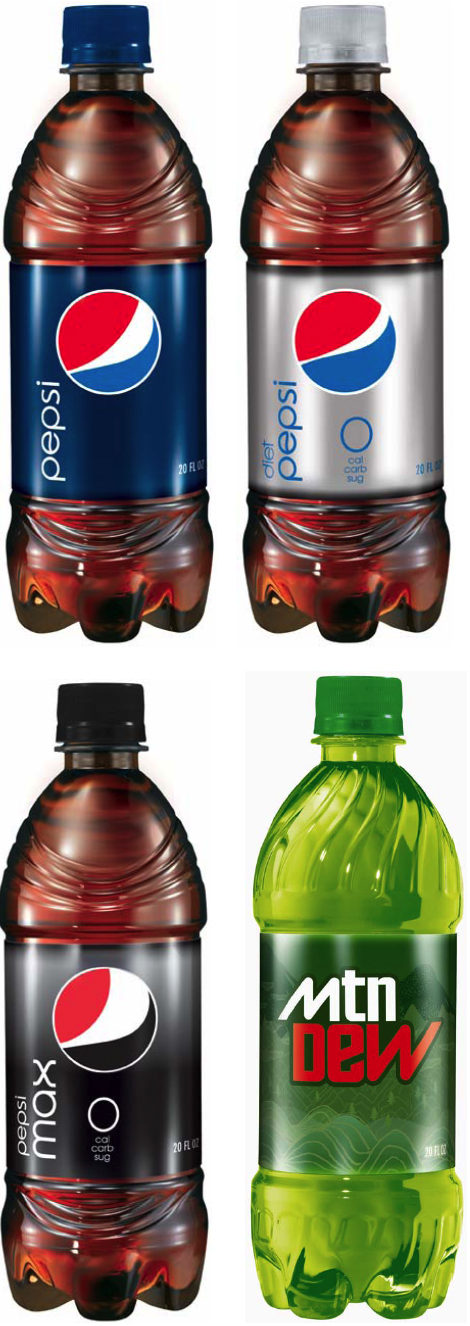
Not to mention: the little Pepsi orb just looks like a comic word blurb or a goofy sail boat... or if you scroll down in the comments here you will see how goofy they've been with the MLB, NBA, and many others...
Tsk tsk Pepsi! What were you thinking!?![]()
Oh really!?
Monday, November 3, 2008 by innovative_edge
Subscribe to:
Post Comments (Atom)
0 comments:
Post a Comment